
It's not that I love liquid glass but I like large click targets and clutter-free navbars.
Image 1:
This is how the Obsidian iOS navbar looks now out of the box. While the contrast is good, the horizontal space is used somehow inefficiently. Around 70%.
Image 2:
My tweaked version that uses all available space and is toned town.
I like it.
(The note content is not related)
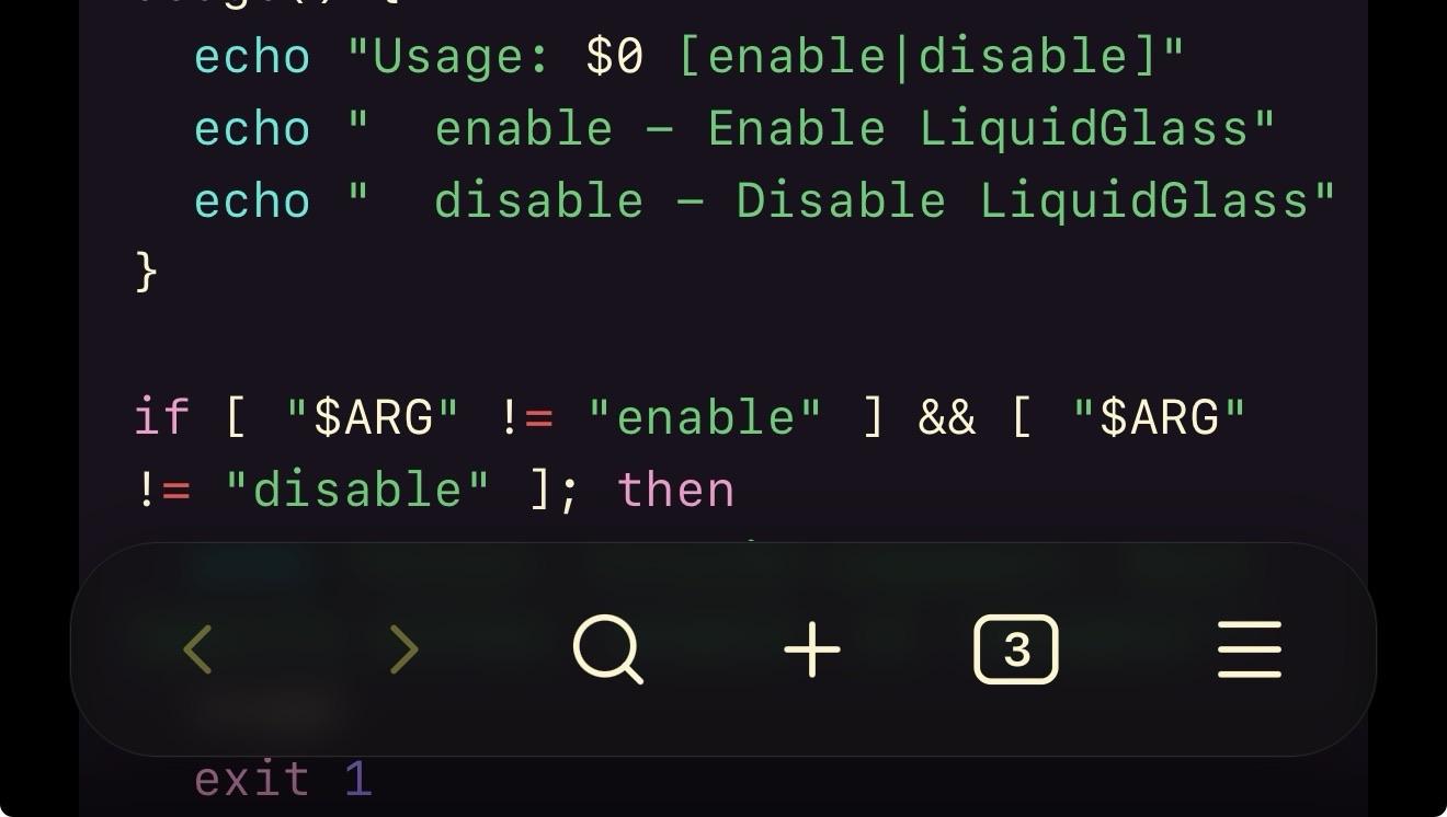
A snippet of code displayed in a terminal or text editor, featuring shell scripting commands related to usage instructions for enabling or disabling a feature called LiquidGlass. Hovering navbar at the bottom but wider and more transparent.
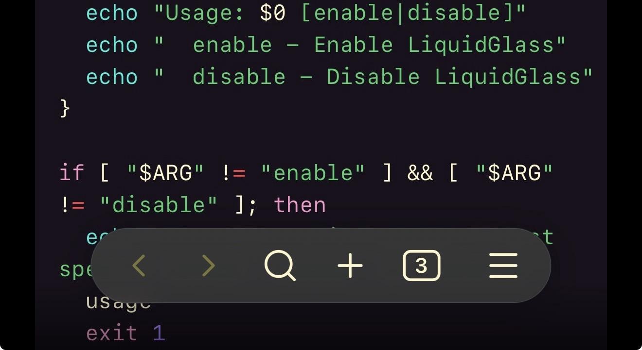
A snippet of code displayed in a terminal or text editor, featuring shell scripting commands related to usage instructions for enabling or disabling a feature called LiquidGlass. Hovering navbar at the bottom.