Discussion
Loading...

Post

  • About
  • Code of conduct
  • Privacy
  • About Bonfire
European Commission
@EUCommission@ec.social-network.europa.eu  ·  activity timestamp 4 days ago

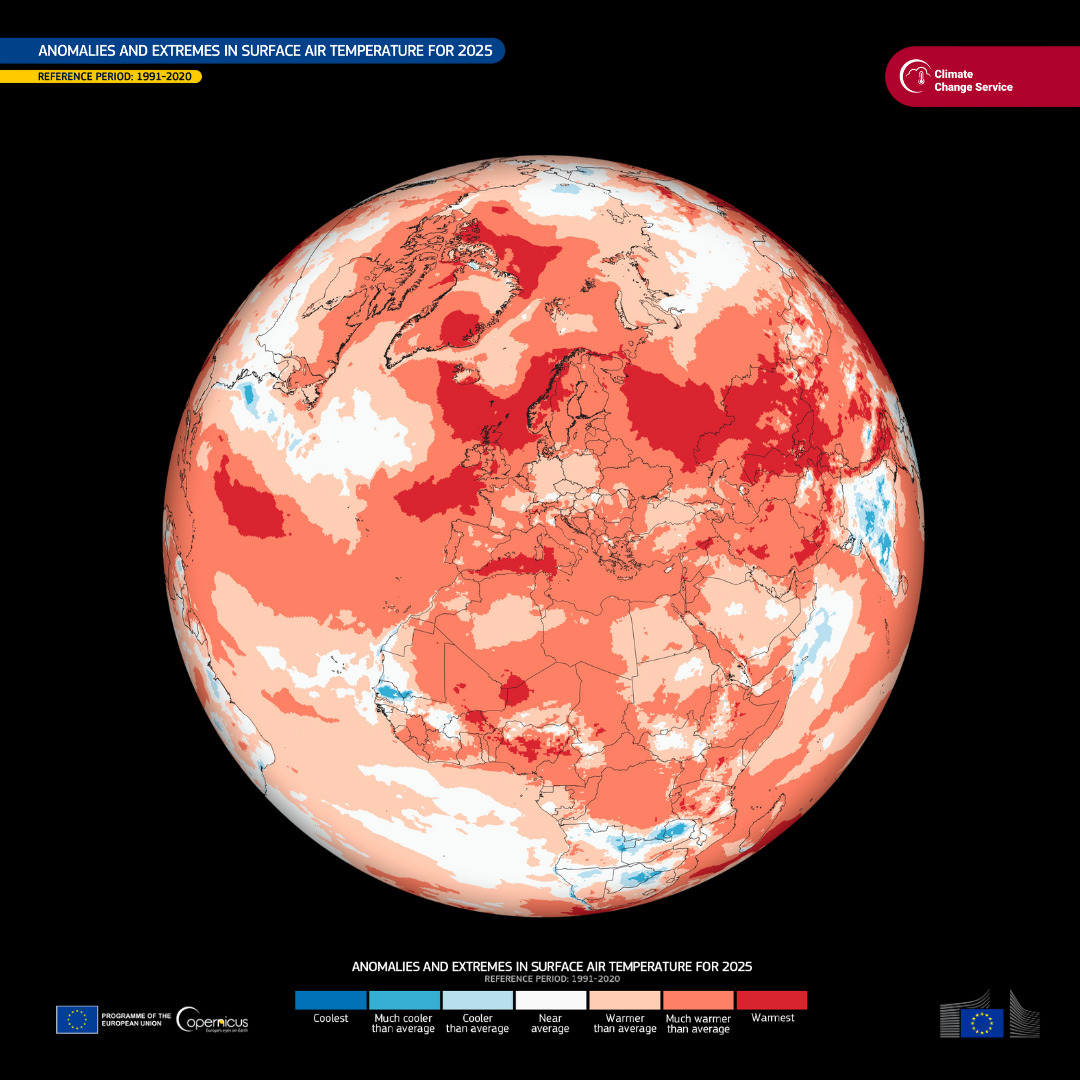
🌡️ In 2025, global temperatures hit the third highest on record.

The last years were marked by extreme heat, wildfires, and storms, all closely linked to rising greenhouse gas emissions.

This year, we will present a new European Framework for climate resilience and risk management.

We remain committed to becoming climate-neutral by 2050.

Full report 🔗 https://climate.copernicus.eu/copernicus-2025-was-third-hottest-year-record

Copernicus: 2025 was the third hottest year on record

Copernicus data show that 2025 was the third warmest year on record, only marginally (0.01°C) cooler than 2023, and 0.13°C cooler than 2024 – the warmest year on record. The past 11 years have been the 11 warmest on record. Global temperatures from the past three years (2023-2025) averaged more than 1.5°C above the pre-industrial level (1850–1900). This marks the first time a three-year period has exceeded the 1.5°C limit. Air temperature over global land areas was second warmest, whilst the Antarctic saw its warmest annual temperature on record and the Arctic its 2nd warmest.
A global map illustrating anomalies and extremes in surface air temperature for 2025, compared to the reference period 1991-2020. The map uses a color scale from blue to red, where blue indicates cooler than average temperatures and red indicates warmer than average temperatures, with darker shades representing more extreme deviations. The map highlights significant warming across most regions, especially in the northern hemisphere, with some areas showing near average or slightly cooler temperatures. The image is provided by the Climate Change Service, with logos of the European Commission and Copernicus at the bottom.
  • Copy link
  • Flag this post
  • Block
Log in

Encryptr.net Social

This is a forward thinking server running the Bonfire social media platform.

LGBTQA+ and BPOC friendly.

Encryptr.net Social: About · Code of conduct · Privacy ·
Encryptr.net social · 1.0.0-rc.3.6 no JS en
Automatic federation enabled
  • Explore
  • About
  • Code of Conduct
Home
Login