In macOS Tahoe, Apple have made the genius move of keyboard shortcuts in the Music app that not only conflict with long-existing system ones, but take priority.
In any text field, ⌘◀ moves the caret to the start of the line, and ⌘▶ moves to the end. Trying to do either of those in the god damn search bar in Music will instead go to the start or end of the playing track! I imagine this is going to repeatedly infuriate me as I inadvertently skip or restart songs.
#apple #macOS #tahoe
Tasks for the rest of the day:
- mid week #Docker container updates
- unpacking #Synology #DP340 and photo session
- #apple #macOS #Tahoe 26.4 beta update on all test machines
(#starwars #ashoka keeping watch!)
#selfhosting #selfhosted #homelab
Tasks for the rest of the day:
- mid week #Docker container updates
- unpacking #Synology #DP340 and photo session
- #apple #macOS #Tahoe 26.4 beta update on all test machines
(#starwars #ashoka keeping watch!)
#selfhosting #selfhosted #homelab
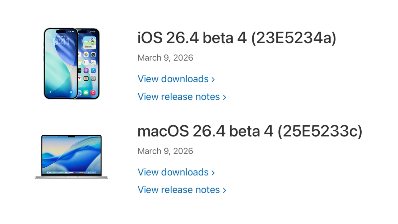
Apple、開発者向けに「macOS 26.4 Tahoe」や「iOS/iPadOS 26.4」のBeta 4を公開。
https://applech2.com/archives/20260310-macos-26-4-tahoe-and-ios-26-4-beta-4.html
#applech2 #macOS_26_Tahoe #Apple #Apple_Silicon #Beta版 #Intel #iOS26_4 #iPadOS26_4 #macOS_26_4 #Rosetta #Tahoe #アップデート
Apple、開発者向けに「macOS 26.4 Tahoe」や「iOS/iPadOS 26.4」のBeta 4を公開。
https://applech2.com/archives/20260310-macos-26-4-tahoe-and-ios-26-4-beta-4.html
#applech2 #macOS_26_Tahoe #Apple #Apple_Silicon #Beta版 #Intel #iOS26_4 #iPadOS26_4 #macOS_26_4 #Rosetta #Tahoe #アップデート
Gah! Wondering about the "transparency" features in Apple's Liquid Glass UI as translated in the #Linux Pear distro shown me. (It emulates #MacOS 26 on a PC). On my Mac, I decided to turn off the accessibility features Increase Contrast and Reduce Transparancy on my Mac and use instead the Clear and Tinted Display settings updated in 26.3 to address the worst of the worst of Apple's UI defilement.
Oh my fucking g@d; It felt like my eyeballs were being SUCKED out of my head by a Jello monster. I reverted immediately. What were the designers thinking!!!
Y'll something fucked up is happening on my MacBook Pro since I've upgraded to Tahoe 26.3.
LOOK AT THESE 4 images of the SAME Verge website article. Count the # of times you see the words "anal intercourse" where it should say AI. FWIW, Ublock Origin is an added extension to each browser (Safari, LibreWolf, Firefox, & WaterFox). Only Safari is rendering the website correctly.
#AI #slop #tahoe #Mac
https://www.theverge.com/ai-artificial-intelligence/890921/grammarly-ai-expert-reviews


