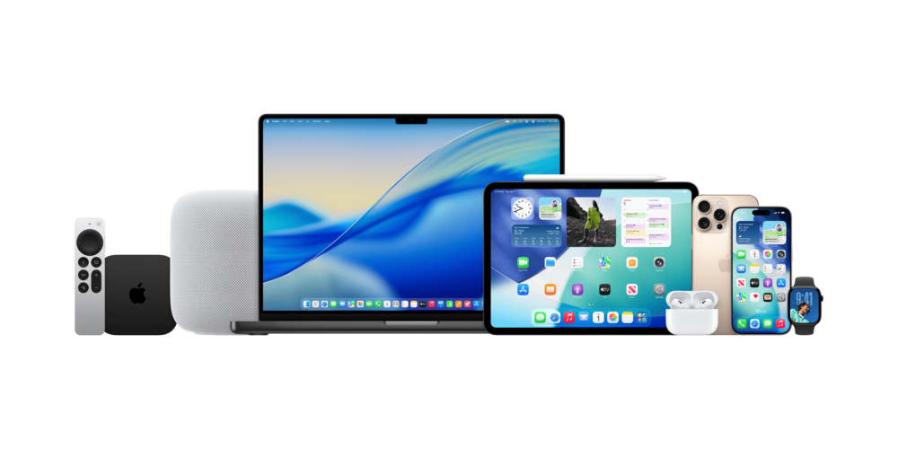
I thought windowing in iPadOS 26 would be a bigger deal than it’s been so far
Barely two weeks after installing Apple’s iPadOS 26 on my iPad mini 6, the feature in this operating-system release that I thought would make the biggest difference in my tablet computing has been among the least remarkable in my daily use. 
This release’s new Windowed Apps mode–Apple’s rebooted attempt to give the iPad’s larger-screen computing experience an interface architecture beyond a scaled-up version of an iPhone’s–has been easy for me to overlook for two reasons.

One is that even after choosing to enable it after installing iPadOS 26, apps continue to launch in full-screen mode. The only ones that look visibly different are iOS apps, which no longer fill the screen when scaled up and instead leave columns of the home screen visible on either side–an effect I found distracting.
To shrink an iOS app to the point where you have room for other apps on the screen, you have to tap and hold a black curve at its bottom right corner. Then you can repeat this with other apps, which iPadOS will cluster in a single layer that appears in place of whatever full-screen app you had just opened up.
But you can also open an individual windowed app above a full-screen app by selecting it from the Dock or the App Library, which is how you can see the Calculator app that Apple finally brought to the iPad with 2024’s iPadOS 18 in front of Safari in the picture above. 
So far, I’ve tried using iPadOS 26’s windowed-apps layer to arrange two iOS apps (Bluesky as well as the Verizon Home app I use to manage our latest WiFi router) with three iPadOS apps that seem like they don’t need full-screen treatment: Apple Maps, YouTube, and Calculator. 
This works, but it can get a little weird. The system doesn’t always provide much of a sense of depth when you position a windowed app above a full-screen app–see how Calculator looks like it’s stuck right on top of Safari in the photo above? And the Exposé view of open apps shows a maximum of four windowed apps, requiring a swipe to the left to see any others you’ve windowed this way. 
Plus, having all of these visually miniaturized programs confined to one layer (except when you pop one or two above a full-screen app) reminds me not of windowing in macOS but of a much older Apple UX: how Desk Accessories worked in System 6.
The second big reason why Windowed Apps seems a bit weak to me can’t be fixed with an interface tweak: I’m using this feature on the smallest-screen iPad now sold, with an 8.3-in. display not that much bigger than the 6.9-in. display of an iPhone 17 Pro Max. I’m sure the larger screen of an iPad Air or iPad Pro would serve as a better stage for this mode.
But I’m too fond of having a tablet that I can easily carry around the house, so that constraint isn’t going away. And for all the quirks I’m discovering with Windowed Apps on my iPad mini’s smaller display, this feature does represent a clear improvement over the Split View and Slide Over multitasking modes that I found far too easy to invoke by accident. 
Zooming out a bit, this feature’s arrival also represents a clear break from years and years of Apple neglecting its tablet operating system. That by itself is an undeniable upgrade, even if this year’s initial results have some janky aspects. 
 #iOSAppsInIPadOS  #iPad  #iPadMini  #iPadMini6  #iPadOS  #iPadOS26  #iPhoneAppsOnIPad  #LiquidGlass  #tablet  #tabletComputing  #UI  #UX  #WindowedApps  #windowing